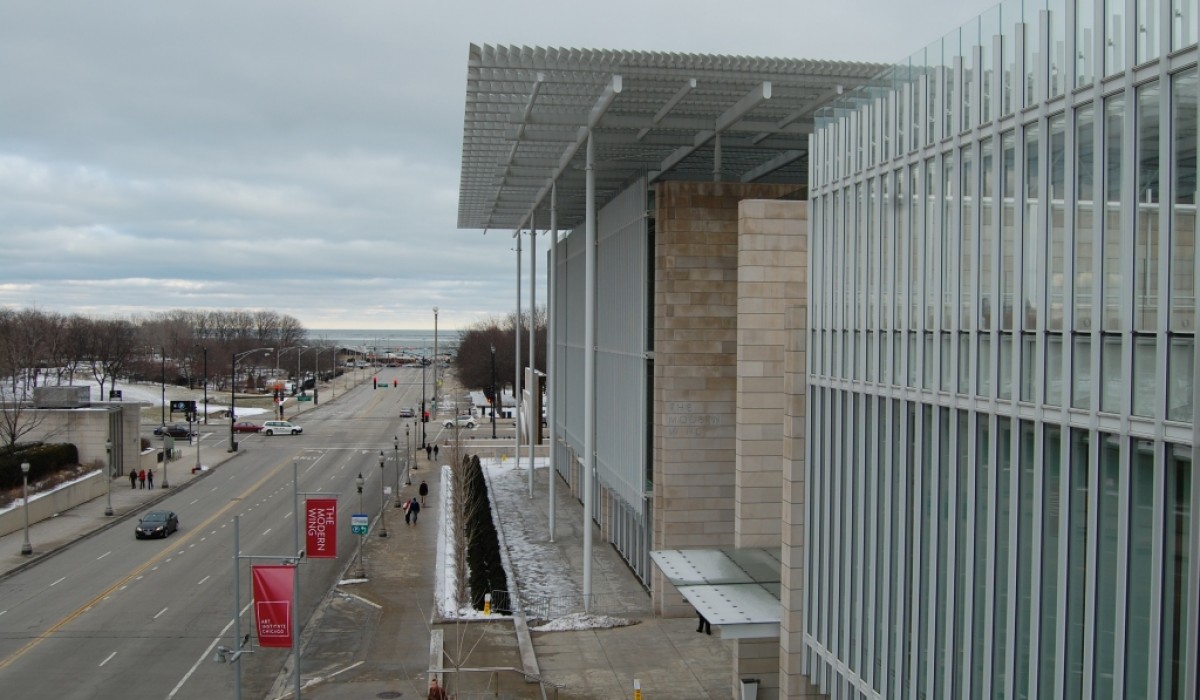
The Modern Wing of the Chicago Institue of Art opened with great fanfare last May and I wasted no time in getting over to see it. I recently returned for a second look at the massive structure with a 300 million dollar budget. The Modern Wing could be called a temple for the Museum’s collection of modern and contemporary art.
It is a huge sparkling white glass, steel and limestone box, built off the north side of the 130 year old institution, making the museum the second largest Art Museum in the country. It is second only to the Metropolitan in NYC.
Lots has been written about the Renzo Piano designed space by people much more knowledgeable than I am, but having visited there twice since the opening I am going to take a stab a visitor’s point of view. I’ll leave the architectural and art reviews to the professionals.
First of all, I really like the store. It’s bright. It’s just off the entrance so you can pop in there without having to go into the Museum, deal with crowds, etc. There is plenty of space and the merchandise seems to be well displayed.
Why do I care? Well, I love shopping in Museum shops, great for gifts or those unusual pieces of jewelry, household items, books and even children’s stuff. The merchandise in a museum store is typically reflective of the museum, well designed and interesting and often not available other places.
I really like the fact my purchases help to support the Museum and keep the ticket price down.
Ok, so the one in the new wing is quite nice. Worth a look if you are in the neighborhood.
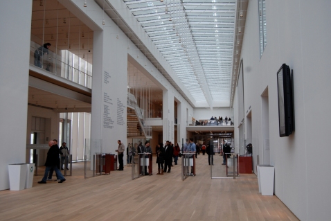
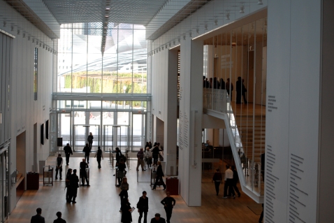
The huge center hall called “main street” of the new wing rises up several stories to a glittering glass roof. The operative word is soaring. Is it a contemporary version of a cathedral? Could be.
One might look at this space and say, wow, too big. Why did they do this? It is really just a connecting space between stairs and galleries and the old part of the museum.
Well, I’m sure it was designed for special events in mind—corporate parties, weddings, and fundraisers. What a glorious use for a museum—allowing people after hours access, grand occasions while providing additional income to bolster the operating budgets. Haven’t been to a party here but it looks to me like it would be quite lovely.
The main galleries are on second and third floor on the east side of the new wing. I love them. Especially the third floor gallery because the ceilings in much of them are well-filtered skylights. Wonderful natural light. Well done. The collection is interesting and well worth taking the time to savor.
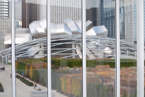
I was mesmerized at the north facing window walls revealing the Gehry Band Shell in Millennium Park. It is a work of art and frankly I think it looks much better from this vantage point than outside in the park. Truly a wow.
The disappointing parts of the museum are the architecture and design galleries—they felt dark and cave like, collection seemed random to me and I didn’t understand the choices for the furniture selection. It felt to me like the museum officials determined that they needed architecture/graphic arts/decorative arts to be represented so they took what they had and lumped it all together in the least appealing space. Hopefully this will improve over time.
I welcome comments from someone who is knowledgeable about this.
One can’t talk about the new wing without mentioning the sleek new restaurant on the top floor with views of the tops of buildings on Michigan Avenue. It is connected to Millennium Park with a sweeping 620 foot bridge. You can eat here without going into the Museum—another revenue generating option I think is great.
If you are meandering around Millennium Park and needing some lunch, I highly recommend making your way up the long bridge and checking it out. And while you are at it, visit the Modern Wing to enjoy the beautifully presented collection. It’s well worth a look.










Comments
3 CommentsMargaret Cheff
Feb 14, 2010Hi Susan,
We are among some of the friends you have “sent” to experience North Pond…and I can attest to its fabulous menu with seasonal fresh ingredients, its friendly atmosphere, and its central location. Would go back in a heartbeat next time I’m in Chicago!
Peggy DePersia
Feb 17, 2010Were you stuck by a remote similarity between the type of view one has from the Metroploitan in NYC over Central Park and the view from the North Wing over Millennium Park? I though it was striking. Having read the Devil in the White City and the noted the ongoing competition between NYC and Chicago, I couldn’t help but imagine some of the intent in these juxtapositions.
Four Great DesignDestinations in Miami | DesignDestinations
Feb 16, 2014[…] But what about the museum? Designed by the folks who did the Bird’s Nest Stadium for the 2008 summer Olympics in China, the PAMM was built and finished just in time for Miami Basel—the huge art extravaganza that takes over the city in early December. I loved the clean lined and contemporary design, much like the Modern Wing of the Institute of Art in Chicago. […]