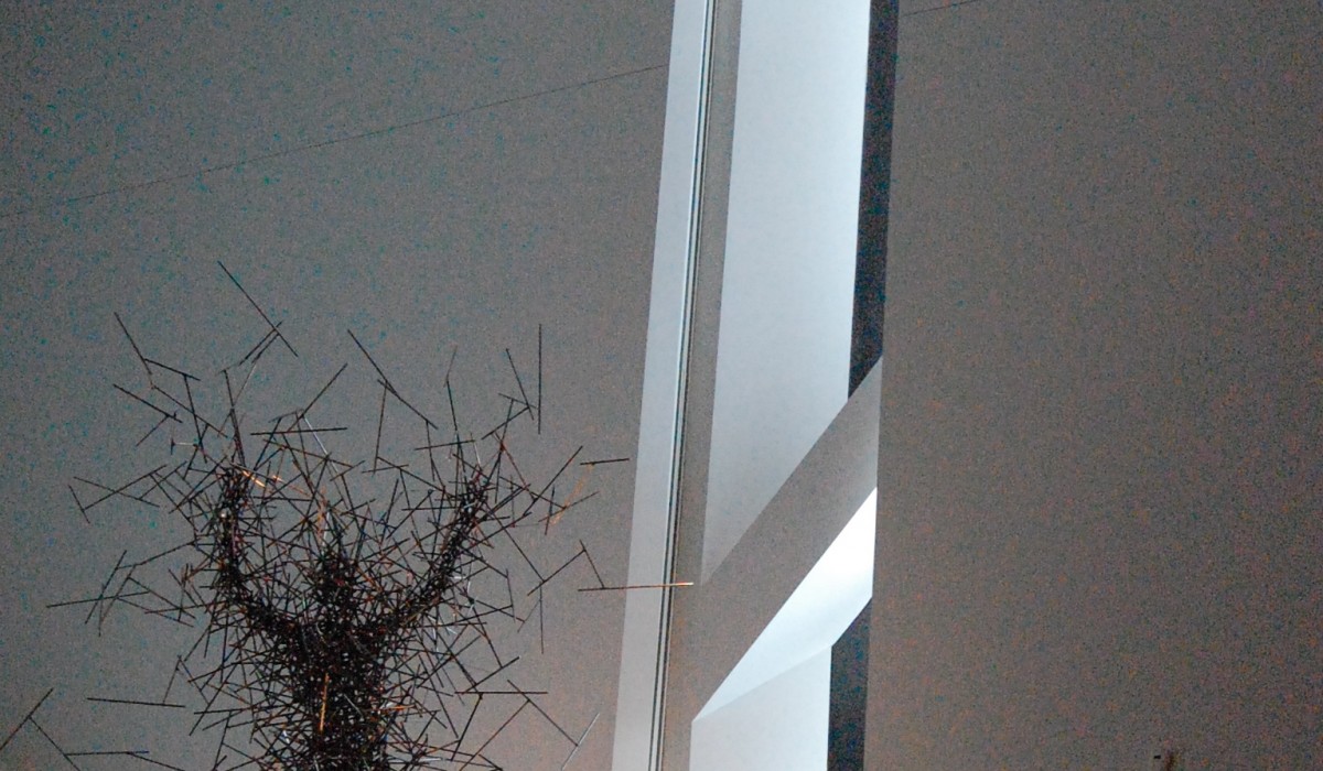
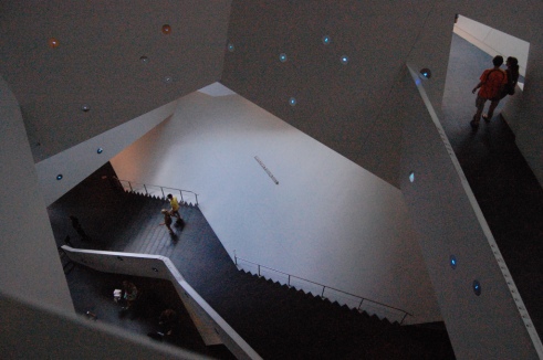
This is how some people might feel after a visit to the Denver Art Museum–upside down and all discombobulated.
A recent visit to the Denver Art Museum (DAM) certainly left me perplexed. What to think about this controversial structure? Is it an interesting urban sculpture or tortured mess? The city’s newest White Elephant or a reflection of the “frontier” culture of the Mile High City.
I’m talking about the new wing, opened in 2006 and designed by Daniel Libeskind, winner of the Ground Zero Master Plan competition. Adjoining and connected to a rather strange boxy six story structure built in the 1970s, the new shiny titanium clad addition is characterized by sharp, angular lines, playing off the Rocky Mountains in the distance. From the outside it looks a bit like the bow of a ship, cantilevered above the street, dangling over passers-by.
It is on a plaza with the Denver Library anchoring one end. Designed by Michael Graves in 1995, it is a modern version of a huge medieval castle. Of course, there’s a Calder. No self-respecting Art Museum is complete without one.
Directly across from the museum are condos that have a “me- too- but-not-quite” feeling. The exterior zigzags and attempts to soar like the new DAM structure. Emphasis on “attempts.”
The inside: well, let me say, it is definitely “vertigo inducing.” There’s a four-story staircase that spirals up the four-story canyon like atrium, getting tighter as you go higher. Walls aren’t where you’d think they’d be. And they angle. All of them. Slivers of light come from hidden skylights.
Normally I have very strong reactions to buildings, but this one, well, I’m not so sure what to think. So I went to the Internet to see what other people thought. Holy Macaroni. There I found heated debate. People either love it or hate it. Nothing in-between.
Some thought it was the best architecture designed since Gehry’s Bilboa. Others. Well, think about these comments:
“If you want your museum experience to rival a trip to Six Flags, you are business in Denver.”
Or
“This should be turned into a skateboarder’s play rink. The kids would love the inclined walls.”
Or
“I felt like I was in Hogwarts, with staircases and doors that disappeared and moved.”
Well, there’s some truth to this statement. Nothing in this building seems to be straight or normal. The architect is in love with angled walls, corkscrewing interiors and bold geometrics. Probably pretty hard for hanging art and even harder for the visiter to follow any logical progression through the building.
But maybe that’s the point. It certainly challenged me about what an art museum should be or how to view art. Thrown off center, I looked at everything with a fresh eye, asking myself, “What’s around the next angle? Where does it lead?”
I loved the element of surprise. For example, the sinks in the rest room near the restaurant “sang” to me. Yes, when I stuck my hands under the faucet, water and a lovely voice singing “Row, Row Your Boat” came out. I checked the other sinks, they did too and in different voices. Now this had me smiling.
And the “shoot out” on the roof is a wonderful spoof on the exciting times in the Wild West.
The focus on the children had me most intrigued. I loved seeing kids dressing themselves in King Tut outfits (hopefully having viewed the exhibit with their parents) and small cubby holes just for young visitors to watch videos within the “grown up” exhibits.
The Denver Art Museum (DAM) has clever marketing: DAM Good Friends is the name of their Membership program. DAM Good Art is emblazoned on t-shirts. Some might call the new building a DAM Expansion. What do you think? If you’ve been to this museum, please weigh in. Would love your thoughts.


Comments
11 CommentsCindy Schad`
Jul 22, 2010Love the review of the new “DAM”! We have put it on our “Bucket List”….though we may bring our dramamine with us:)
smithsj
Jul 22, 2010Funny. Be sure to take Abby. So much for kids to do and don’t miss the Singing Sinks. I didn’t mention it in the post but the kids area in the store is delightful. Cuddle up and read. We loved a “bubble jumping area” for kids and adults alike. All video generated. Couldn’t get a good photo.
Doreen Dal Santo
Jul 22, 2010I agree with you totally. I was out there a couple of weeks ago and was pleasantly suprised, but at the same time I felt a little uncomfortable and irritated while (subconsciously) trying to make sense of it all. I felt like I needed to hear the intent to fully appreciate it.
Keep up the good work, I really enjoy your blog!
smithsj
Jul 22, 2010Thank you, Doreen. I appreciate your comments. sjs
R. Lyle Boatman, ASID
Jul 24, 2010Starchitecture! It really amazes me how gullible some committees can be. This is starchitecture, nothing more nothing less, and has more to say about the ego of the designer than the experience of the user. Provocative, yes. Great building, uh… no. Interesting experience, maybe.
It is terrible to have such strong opinions about a building which I have never visited… I will have to rectify that… the visit part. I have doubts that I could change my mind about this building.
Thanks for the stimulating article.
smithsj
Jul 25, 2010I always appreciate your comments, Lyle. Thank you.
Melanie Rogers
Jul 25, 2010I have not been, and from your pictures, the exterior is a turn off, the interior is intriguing, so I am thus far ambivalent on the building. What I do like is the art you selected to photograph, and the concept of the round-singing sinks. Now that is “feel good” art at its cleverest. It looks as though they have an excellent curator. Thanks for the primer.
commercial loans
Aug 23, 2010Excellent blog! I actually love how it is easy on my eyes and also the facts are well written. I am wondering how I may be notified whenever a new post has been made. I have subscribed to your rss feed which must do the trick! Have a nice day!
smithsj
Aug 25, 2010HI,
Thanks for your nice comments. it is really easy to get a notification of when I do a post. All you do is enter your email address in the space indicated on upper right hand corner of the page. Follow a couple of simple prompts and then you will get a short email notice any time I do a post. Typically I post once or twice a week.
You can also keep scrolling down at the end of comments and there’s an email update spot at the bottom of the page as well.
sjs
video games online
Aug 28, 2010Such a well written post.. Thnkx for sharing this post!
DesignDestinations: Celebrating 125 Posts | DesignDestinations
Dec 3, 2010[…] Denver Art Museum. I always go to Museums when I travel. Just part of the deal. This was was particularly […]