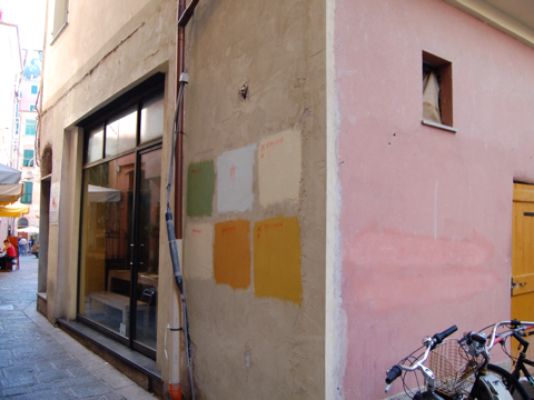
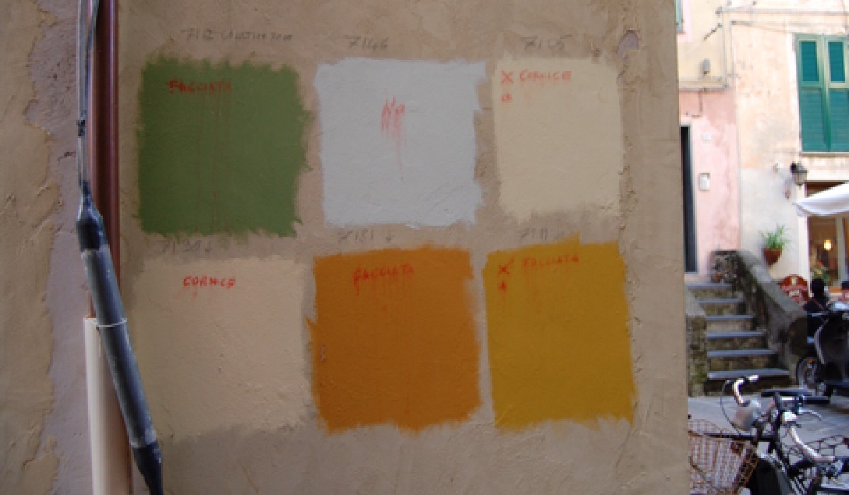
Couldn’t resist capturing on camera. I would love to know what you think.
Clearly the choice for the new color for this very old wall in the heart of Monterossa is up for public vote.
What would you chose?


Be In the Know. Sign up to have DesignDestinations delivered right to your inbox, weekly.

Couldn’t resist capturing on camera. I would love to know what you think.
Clearly the choice for the new color for this very old wall in the heart of Monterossa is up for public vote.
What would you chose?


Comments
5 CommentsKate Dernocoeur
Oct 8, 2010Ohhh….tough decision, given the nearby colors. Maybe the bottom middle??
Cindy Schad`
Oct 8, 2010I’m not a designer, but….I think the beige/cream on the lower left would be my choice, after viewing the deep turquoise shade on the building in the background….AND, the pink wall right around the corner!
Peggy DePersia
Oct 8, 2010I’m going for that quietly sumptuous green. I can see it wrapped around that golden door on the side of the building.
R. Lyle Boatman, ASID
Oct 11, 2010Are you kidding? There is only one choice: GREEN. With the pink in the background, there is no other choice. I always wanted a room with pink and green when I lived in Michigan… I was just too image conscious to make it happen. But in a sunny climate, such as you are visiting, this would be a delicious combo. And with the slightly desaturated green that is shown, I believe the combo of the two will shimmer.
I did a color study when in design school in Minnesota that related colors to their optical compliments (the color image that your eye retains after a strong stimulus is repeated for several minutes). And this green and that pink are perfect optical compliments.
Melanie Rogers
Oct 11, 2010I love Lyle’s well thought out comments, and agree with his theory. However, I am not a fan of that particular green, as I picture it all over that wall. Too cloying. I think it should be lightened to the same value as the pink, and perhaps have a bit more yellow to it. That being said, Susan, what is up with these French people and their garish yellows for interiors??? I have just spent the last week repainting an apartment in Luxembourg that faces an amazing cliff face with sedimentary layers of the ages, in all their earthy delights. The flat had been the most gawd awful bright lemon yellow… talk about a show stopper! The eye couldn’t get past the color to travel out the 10 foot windows to admire the rocks. Fixed it.